
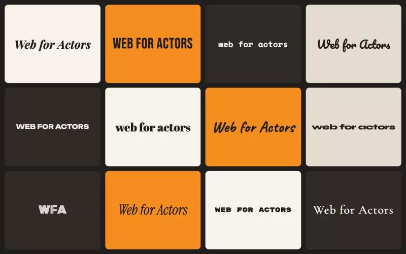
When a page uses a downloaded font, the text is painted first in whatever font is already on the device, then repainted when the real one arrives.
Those two fonts set at different widths and heights. So the same words take up different space before and after, and everything below them moves. On one home page this was the last remaining layout shift, 0.074 of a 0.1 budget, and the only contributor left once the slider and the audio player had been dealt with. The grader listed "Web font loaded" three times, which is three families arriving at three separate moments.
The fix downloads nothing
A second font declaration is added that points at a font already on the device, and stretches it, using size adjustment plus ascent and descent overrides, until it occupies exactly the space the real font is going to occupy.
The fallback and the real font are then the same size. The swap still happens, your chosen font still arrives and still gets used, and nothing moves when it does.
This is better than the common alternative, which removes the shift by sometimes never showing your chosen font at all. That trades a visible bug for silently ignoring a setting you made on purpose, which is not a trade worth taking on a page where the typography is part of the point.
The numbers are measured, not borrowed
There are tables of these values on the internet and they are inconsistent. Each family's font file was read directly instead.
The width figure is the mean advance across the lowercase alphabet plus a space, rather than the metadata field usually used for this. That field is populated inconsistently across foundries and counts glyphs that body text never uses, so it is the wrong number wearing the right name.
Scope came from the data rather than a guess. There are 63 distinct font families in use across accounts. Forty-six of them are downloadable webfonts and are covered. The other seventeen are system fonts, already on the device, which never download and so never shift anything.
The property that makes it safe
A family with no entry emits no fallback declaration and behaves exactly as it does today. So a gap in the table is a missed improvement and never a broken page.
That matters more than the optimization does. This touches every page on the platform, and the acceptable failure mode for something at that scale is "no change", not "slightly wrong everywhere".
What you should do
Nothing. If you have chosen an unusual font it may not be covered yet, in which case your page behaves as it always has.
Related: every image says how big it is, which was the larger half of the same problem, web fonts served from a CDN, font choices for actor websites and page loads across all designs.
Finished reading? Build yours next.
It takes about 76 seconds and it starts free, with your credits, headshots and reels already in it.
Build mine free→