
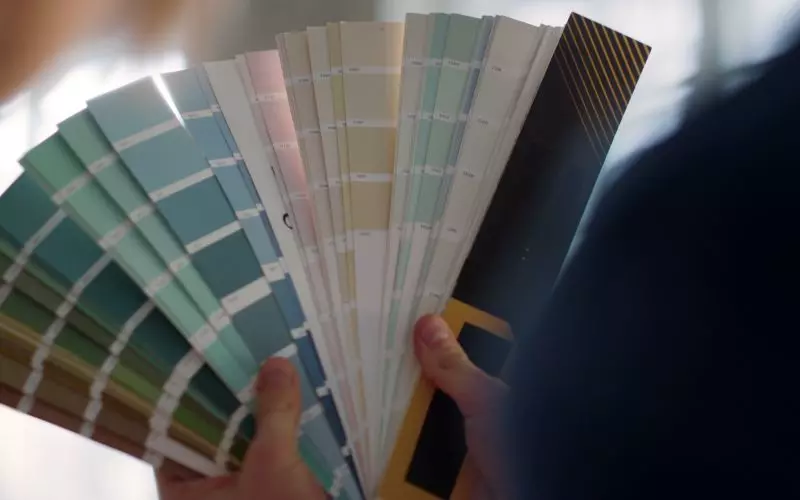
Interfaces are usually good at letting you pick something and bad at letting you go back to nothing. Picking a background was one click. Getting back to a plain one was, for a while, only offered if the background you had was a file you had uploaded yourself.
Which meant that if you chose from the palettes of ready-made textures, there was no way back at all. The palettes offered you a choice of backgrounds and no option to have none.
A "None" swatch, in the same language as the rest
There is a None swatch above the palettes now. Same size as the other tiles, same selected outline, and it shows as selected when you have no background set. That last part matters more than the button itself: the page now states what your current setting is even when the setting is "nothing", instead of showing you four palettes with nothing highlighted and leaving you to work it out.
Selecting it and picking a tile go through the same handler, and it only asks you to confirm in one case. Re-picking any of the ready-made tiles is instant, because you can pick it again just as easily. Clearing a background you uploaded yourself asks first, because that file is not kept and re-uploading it means finding it again.
Grayscale, and settings that reach everywhere
Grayscale is the other appearance setting worth understanding, because it has to reach everything to work. A site in mono with one section still in color does not read as a style choice, it reads as a mistake.
Your headshots follow the setting now. They previously did not, so a mono site could show grayscale credit posters beside full-color headshots on the same page. The cause was that photographs are prepared in three versions and only two of them carry the treatment, and the headshot list was built from the third. It now makes the same settings check the rest of your photographs make.
If you want the mono look, it works on any design, and it pairs with choosing your own color scheme for the parts that stay in color.
One more setting that reaches every page
Your menu is in this family too. A design that provides its own Home entry, meeting an account that also has a page called Home, used to draw it twice. Both are now merged into one entry, and which copy wins is decided carefully: your title and your icon are kept, and the position the design intended is kept. Taking either side wholesale would have thrown away something you had chosen. The wider rebuild is in menus rebuilt from your account, and the ordering is yours.
All of this lives under appearance in your admin, and none of it requires changing designs. If you have not settled on one yet, the catalog is the place to start.
Finished reading? Build yours next.
It takes about 76 seconds and it starts free, with your credits, headshots and reels already in it.
Build mine free→